
Letterhead, along with other printed materials like business cards and brochures, are a visual representation of you and your business. Although the technology exists for businesses to create these materials in-house, it's generally best to seek the services of professional designers and printers to maximize the effectiveness of your presentation. If your printed materials look "home made" your business may be perceived as small-time and unprofessional. Quality letterhead feels good in the hand and creates an impression by its very heft and texture well before the reader's eye falls on the text.
In working with designers and printers, you will be called upon to make many choices in terms of layout and materials. Having a basic understanding of the placement of elements in your letterhead, the typographic devices that can be employed, and the criteria on which papers are selected will ease this process and result in the production of letterhead that perfectly represents your organization.
Content to Include
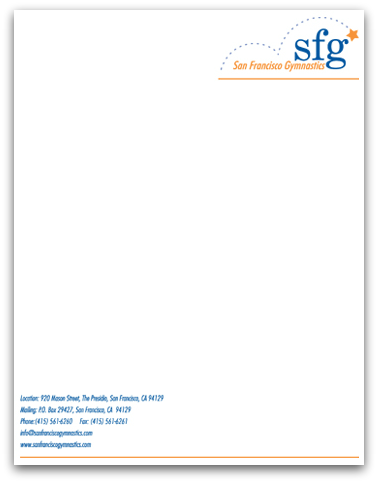
The company name is usually the primary element in a letterhead and appears in the largest type. A traditional placement would be centered with the other elements appearing beneath the company name although there are many acceptable variations on this theme. The best letterheads are cleanly arranged with plenty of blank spaces and no crowding of the elements, which typically include:
company name
logo
address
contact name (optional)
phone numbers
fax numbers
email address
A simple statement or selling point about your business or service may also be used and is often placed beneath the company name.
Basics of Layout
While the company name should be the largest type used, the other elements should be sized from 9 to 12 pts. Anything smaller will not be legible. Avoid using more than two typefaces and be sparing with bold and italic elements. Don't use all capital letters as they are difficult to read. The idea is to draw the eye directly to the company name, not to have it distracted by decorative elements.
The typefaces chosen should match the purpose and personality of the business. The letterhead of a toy factory or an amusement park will be different from that of a lawyer's office or that of a funeral home. In general, serif types like Times New Roman (serifs are the little "feet" on the letters) are regarded as formal while san serif types like Arial (with no "feet") are more casual. Decorative and ornate types should be used only with great care and only if they are clearly legible and appropriate to the business.
Paper and Ink Colors
Colors should be used cautiously. Remember, they're not the only way to give visual depth to a letterhead. Varying percentages of gray scales can achieve the same effect. When colors are employed they can be either an element of the paper itself or of the ink used. Whole books are devoted to the psychology of color. Some shades are associated with gender while others connote "temperature" or mood.
Masculine colors include black, gray, dark brown, deep purple, dark green, rust, and dark burgundy.
Feminine hues might be light blue or pink, flesh, yellow, peach, light gray, lavender, rose, mauve and pale green.
Warm colors are orange, yellow, red, gold, terra cotta, and beige. Cool colors include light blue, turquoise, teal, light gray, silver, mint green, and white.
Natural or earth tones are also seen as "warm" and include browns, golds, burnt orange, dark reds, and similar shades.
Bright or cheerful colors might be pink, blue, red, green, yellow, bright orange, and purple.
Elegant tones include black, gray, navy, burgundy, forest green, and metallics like silver, gold, and platinum.
Paper Weight and Grades
Using colors within the letterhead design or typographic elements is a safer call than choosing a colored paper. White, cream, beige, or gray papers generally work best. The essential concepts in choosing paper are to create a physical experience that involves an interplay of the feel of the sheet in the hands and how the ink and other elements play against the texture and tone of the paper. Some papers simply "feel" more expensive and "upscale" than others.
Papers are classified by grade and weight, the two factors that must be understood to make a good choice. There are five basic grades of paper:
bond
offset or uncoated book
cotted book
text
cover
Bond papers are normally used for letterhead and are themselves divided into a variety of distinctions involving brightness, opacity, and fiber content. A paper's weight is the weight of 500 sheets cut to a standard size.
Stationary and letterhead calls for a reasonably heavy bond of around 24 lbs. (These papers are sometimes referred to as "writing paper" and will be made with a percentage of cotton fiber, around 25 percent, and will bear a visible watermark when held up to the light.) Bond papers will be offered in finishes like "laid" or "linen."
The best course of action is to examine multiple paper samples to determine which best suits your business. (If your letterhead will be run through a laser printer be sure to discuss this with the printing company since the paper will need to be appropriate for use in the machine and heat resistant inks must be selected.)
Other Layout and Printing Options
A variety of typographical devices and processes can be used to create letterhead:
text can be placed on a path so that it follows a wave or forms a circle
type can be reversed on a colored panel so that it appears white
graphical elements like gradient screens or background photographs can "bleed" or run off the edge of the page
with "thermography" raised images can be created on the page and even augmented with metallic foil registered embossing
phantom screens can make the company logo appear in the center of the sheet as if it were a watermark.
(If you use a phantom screen be sure to select a paper that does not have its own watermark.)
Ask your printer to explain any or all of these processes to you, but remember, less is always more. Don't employ so many gimmicks that they overwhelm the letterhead or detract from the professional image you are seeking to create.
Production and Design Tips
Try to make your choices regarding paper grade and weight, ink, and graphical elements before approving a design. Some typographic conventions and printing processes will not work with some paper and ink choices. Also, professional designers will want to know what materials will be employed since these will effect their design decisions.
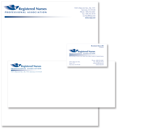
Before you make your paper choice ensure that matching envelopes are available. Generally it is more cost effective to have your envelopes printed at the same time as your letterhead. The envelope should contain the logo, company name, and address in the upper left-hand corner. The standard envelope sizes are:
#10 (9 1/2" x 4 1/8")
#9 (8 7/8" x 3 7/8")
#6 ( 6 1/2" x 3 5/8")
monarch (6 1/2" x 3 5/8").
Follow through with the same look and "tone" for all your printed materials. You don't want to use one set of typefaces and colors on your letterhead and another on your business cards and brochures. The more coherent your printed materials, the more professionally you present yourself and your company.
When all of these elements come together in the right combination your letterhead can be one of the most effective representations of you and your business. People unconsciously react to the feel of quality paper in their hands and well designed graphical elements presented to their eyes. In any business there are corners that can be cut but letterhead shouldn't be one of them. Good letterhead creates a positive impression straight out of the envelope, one that speaks to quality and professionalism -- yours.
Any Questions? Give us a Call 650-377-0700
Or send us an e-mail